Journal · framing
Choosing a frame color and style — without the spiral.
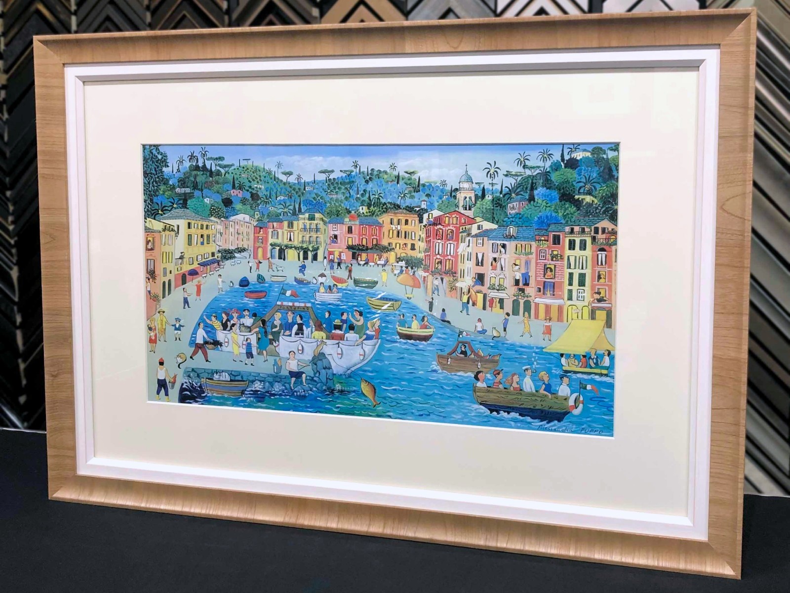
The frame is not a separate decoration. It's the last edge of the image. Pick for the art first, the room second — and ignore whatever was trending on a feed last month.
One decision at a time: color family, then weight, then finish.
Start with a color family
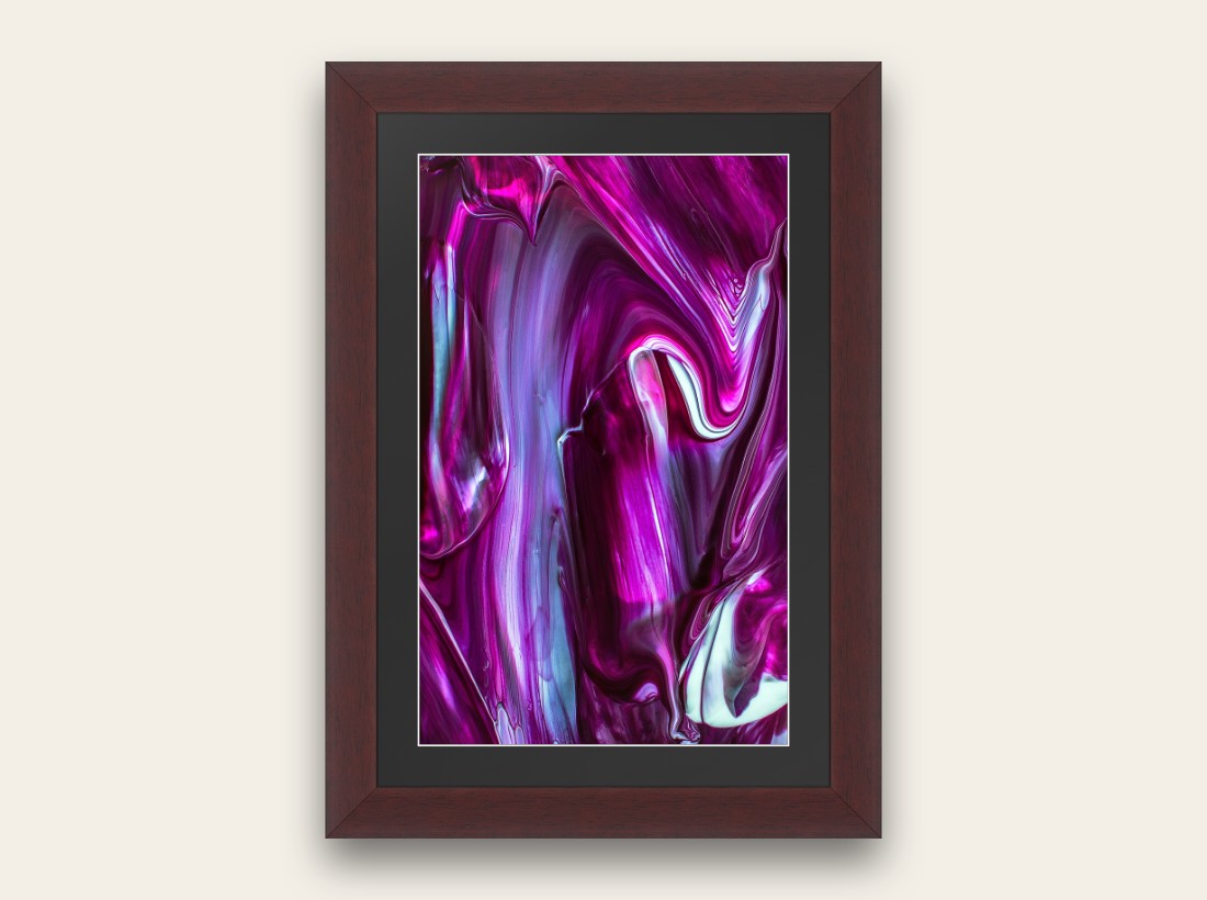
- Neutrals (black, white, soft gray, natural pale wood) — safest when the art will rotate, or when the image already carries strong color. Black sharpens photos; white opens abstracts; pale woods calm coastal rooms.
- Warm mouldings (cherry, walnut, bronze, soft gold) — when the art is already warm: sunsets, skin tones, ochres, Florida evening light. The frame echoes; it doesn't invent a new temperature.
- Cool mouldings (silver, pewter, cool gray) — blue-heavy photographs, modern black-and-white, steel-and-glass interiors.
If you're torn between two colors in the art, pull the quieter one into the frame and let the loud one stay in the picture. Or put the loud color in a thin mat line and keep the moulding quiet.
Weight: thin, medium, or statement
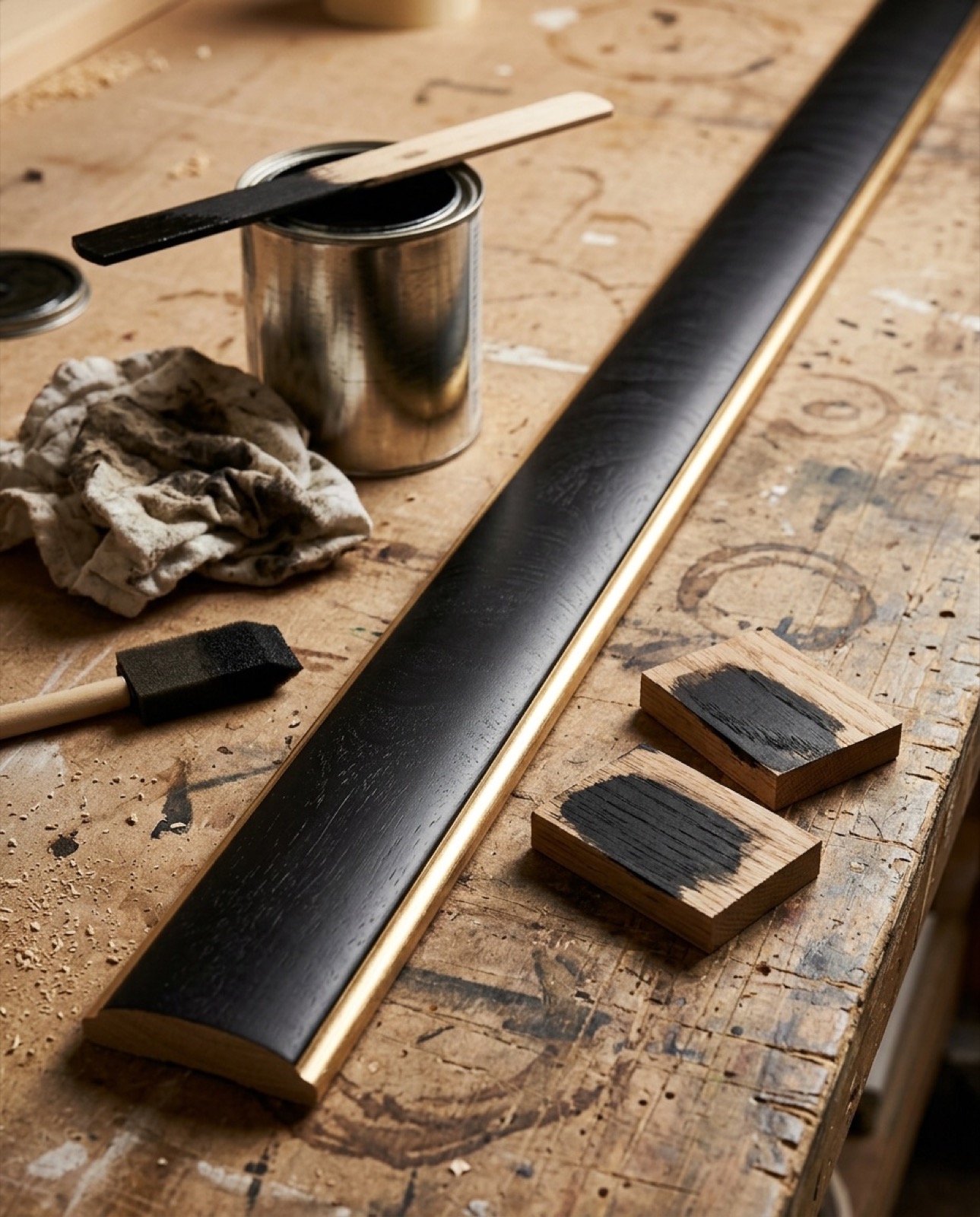
A skinny profile on a large piece looks nervous — one of the mistakes we talk people out of. Medium profiles carry most home work. Statement / gilded / stacked mouldings earn their keep on heirlooms, oils, and anything that already feels ceremonial. Price moves with width and finish; real starting numbers are on the cost guide.
A shortcut: shop by collection
Our seven collections group mouldings that already agree — useful when you're building a gallery wall or furnishing a condo and don't want seven unrelated metals. Try a piece on your photo in the designer; the price updates as you change profile and finish.
Don't forget the mat and glass
Color choice fails when the mat fights it or the glass turns into a mirror. Mats and floats · glazing tiers · Florida light: care guide.
Ways in
Browse collections · Try frames on your photo · See corners in person · Trade / design accounts.
Match the art's temperature. Then pick the weight.
Everything else is preference — and we can show you both on your file.
Try a frame on your photo